Use background-image, not background-color, for a gradient. The first declaration is a legacy sRGB approximation; supporting browsers use the second. Test in your target browsers.
The fallback may look different because it uses legacy sRGB interpolation.
One or more colors lie outside sRGB. Source/OKLCH preserve that range; HEX, RGB and the legacy fallback use mapped sRGB approximations.
Color calculations run in your browser. The website still loads assets, advertising and analytics.
One gradient, deliberate choices
Control the stops and inspect the transition before using it.
Place colors where you need them
A linear gradient follows an angle; a radial gradient expands from a center. Add, remove or reverse stops and adjust each position and alpha. Two stops at the same position produce a deliberate hard edge.
Compare the middle, not just the endpoints
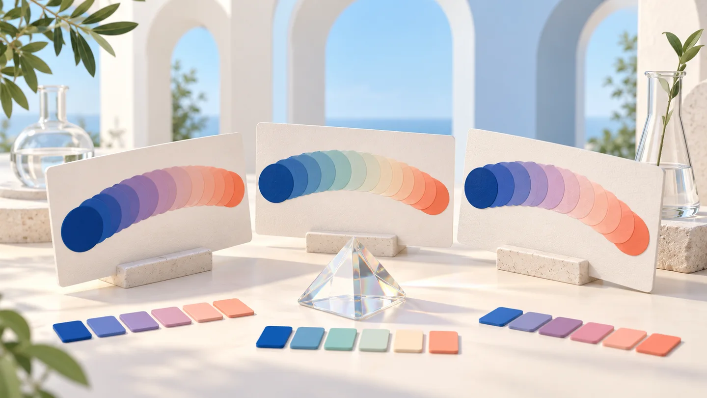
Different interpolation spaces can produce different intermediate colors. Compare sRGB, OKLab and OKLCH using identical stops. Color notation is a separate choice: changing HEX to OKLCH does not automatically choose OKLCH interpolation.
How to create a CSS gradient
Start with the geometry, then refine color and compatibility.
01
Choose the direction or center
Select linear and adjust the angle: 0° points up and 90° points right. For radial, choose circle or ellipse and move its center. The preview uses the same shape and position as the exported CSS.
02
Edit the stops and compare spaces
Use two to six colors with positions between 0% and 100%. Enter alpha in the color or set opacity. Compare the three spaces; the shorter/longer hue option applies only to OKLCH. The solid backdrop makes transparency visible.
03
Copy CSS and verify its context
Choose source, HEX, RGB or OKLCH notation, then copy or download the stylesheet. Keep both gradient declarations for fallback behavior. Check text at its actual position across the background; a solid-color contrast check cannot certify an entire gradient.
Continue your color workflow
Explore a palette or check a real foreground and background.
Color palette generator
Build five-color harmonies, lock favorites and export the palette.
Compare a five-color palette under protanopia, deuteranopia and tritanopia simulations. Preview labeled statuses and charts using the Machado 2009 model.
Stops, transparency, interpolation and browser support.
What is the difference between linear and radial gradients?
Linear gradients transition along a straight direction. Radial gradients spread from a center as a circle or ellipse. In this tool the radial size is farthest-corner; move the center to change its placement.
Why does the middle of my gradient look dull?
Intermediate colors depend on the endpoint colors and interpolation space. Compare sRGB, OKLab and OKLCH with the same stops. OKLCH can follow a different hue path, but it is not automatically better for every combination.
Can I add transparent colors and more than two stops?
Yes. Use two to six stops and set each opacity or enter a color with alpha. The chosen solid backdrop shows through transparency. The opacity slider sets alpha rather than multiplying the existing alpha.
What happens when stops are out of order or share a position?
Rendering sorts stops by percentage while keeping the editor rows stable. Equal positions retain row order and create a hard edge. The first and last colors extend to the edges if their positions do not reach 0% and 100%.
Does OKLCH color notation mean OKLCH interpolation?
No. A color’s notation describes that stop; the interpolation selector controls how colors between stops are computed. The generated modern CSS explicitly includes in srgb, in oklab or in oklch, so that choice is unambiguous.
How does the CSS fallback work?
The stylesheet sets a solid background and two background-image declarations. The first uses mapped RGB stops and legacy gradient syntax. Browsers that accept the second use the selected interpolation. The fallback can differ visually and is not a pixel-perfect reproduction.
Is text over the gradient automatically accessible?
No. Contrast can vary with position, element size and transparency. Review the actual text location and worst background under it. Add an appropriate solid text surface when needed; a ratio for two isolated stops does not certify the gradient.
Can I export an image or share my settings?
This version exports CSS text and a .css file, not a raster image. The URL fragment keeps your current stops and settings for reloads and language changes. Share that full URL to reproduce the configuration; browsers and displays may render colors differently.