UI theme generator Turn a brand color into a working interface.

Create backgrounds, text, actions and status colors with their intended pairings.

Build a light and dark UI theme

Give each color a role, then inspect the actual pairings.

Try the theme on components

Exports contain both modes. The preview mode selects which roles you are editing.

Your workspaceView roles

COMPONENT PREVIEW

A place for your next idea

Try a brand color across backgrounds, text and actions.

Success fill

Warning fill

Error fill

Mapped brand original: #2563eb

Only these pairs are checked. Component states, content and the full product still need review.
Edit roles in the current mode

Edits apply only to this mode and remain when you change the source colors. The generated checks update immediately.

Check the listed pairs

Text uses your selected target. Focus, control borders and action boundaries use 3:1 references. Values are checked before display rounding.

PairRatioTargetResult
Main text / Page background17.99:14.5:1Meets target
Main text / Card surface18.78:14.5:1Meets target
Secondary text / Page background6.28:14.5:1Meets target
Secondary text / Card surface6.55:14.5:1Meets target
Text on primary / Primary action5.17:14.5:1Meets target
Text on primary / Primary hover6.15:14.5:1Meets target
Link / Page background4.95:14.5:1Meets target
Link / Card surface5.17:14.5:1Meets target
Focus outline / Page background5.95:13:1Meets target
Focus outline / Card surface6.21:13:1Meets target
Control border / Page background3.22:13:1Meets target
Control border / Card surface3.36:13:1Meets target
Text on success / Success fill4.96:14.5:1Meets target
Text on warning / Warning fill5.34:14.5:1Meets target
Text on error / Error fill5.67:14.5:1Meets target
Primary action / Page background4.95:13:1Meets target
Primary action / Card surface5.17:13:1Meets target

Use the result

/* Palette Lab: sRGB roles; use the listed foreground/background pairs. */
:root {
  --pl-brand-original: #2563eb;
  --pl-background: #f5fbff;
  --pl-surface: #ffffff;
  --pl-foreground: #0f1216;
  --pl-muted: #575e68;
  --pl-border: #858d97;
  --pl-primary: #2563eb;
  --pl-primary-hover: #1956dd;
  --pl-on-primary: #ffffff;
  --pl-link: #2563eb;
  --pl-focus: #275ac8;
  --pl-success: #298033;
  --pl-on-success: #ffffff;
  --pl-warning: #926100;
  --pl-on-warning: #ffffff;
  --pl-danger: #ae4440;
  --pl-on-danger: #ffffff;
}
.dark {
  --pl-background: #080b10;
  --pl-surface: #12181f;
  --pl-foreground: #eaeff5;
  --pl-muted: #9ea5b0;
  --pl-border: #6b727c;
  --pl-primary: #2563eb;
  --pl-primary-hover: #2f6df6;
  --pl-on-primary: #ffffff;
  --pl-link: #3878ff;
  --pl-focus: #6ba1ff;
  --pl-success: #61b565;
  --pl-on-success: #000000;
  --pl-warning: #cb9317;
  --pl-on-warning: #000000;
  --pl-danger: #e97871;
  --pl-on-danger: #000000;
}

CSS and Tailwind v4 export both modes; add .dark to a parent to select dark colors. DTCG JSON contains explicit light/dark groups, not an automatic mode resolver. The JSON report includes inputs, overrides and checks.

Color calculations run in your browser. The website still loads assets, advertising and analytics.

Turn a brand color into a working interface.

Give each color a role, then inspect the actual pairings.

Edit roles in the current mode

A useful interface needs more than a row of swatches. Give text, surfaces, controls and feedback distinct roles, then see them together in a component preview. The brand original remains separate from derived UI colors.

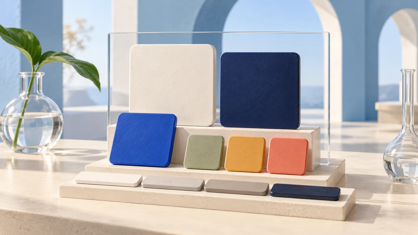
Ivory and navy foundation tiles with blue and status-color swatches

Preview mode

Review the same interface in light and dark contexts. Edit either mode independently, keep the other intact and inspect the listed contrast pairs before copying the theme into your project.

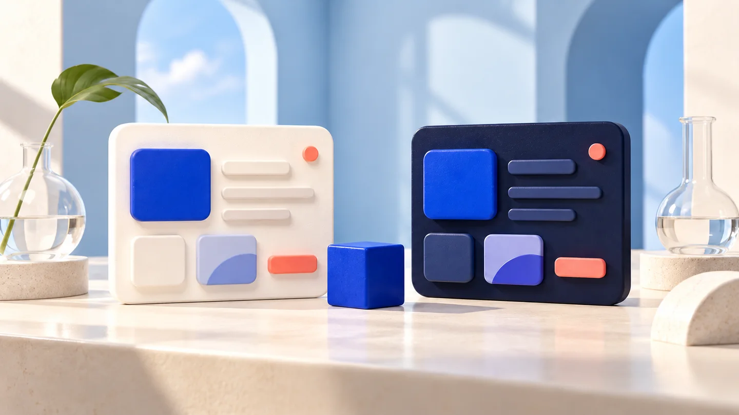
Matching miniature light and dark interface panels with a blue brand cube

How to build a UI theme

Give each color a role, then inspect the actual pairings.

01

Brand color / Neutral reference

Enter an opaque brand color and neutral reference. Choose a text contrast target; generation starts from mapped sRGB values.

02

Edit roles in the current mode

Switch light/dark, edit role swatches and inspect failed pairs. Reset both modes to remove overrides when you want a fresh result.

03

Use the result

Choose CSS, Tailwind v4, DTCG groups or a full report. Save the complete URL for later and test the theme on your real components.

UI theme generator FAQ

Create backgrounds, text, actions and status colors with their intended pairings.

How is this different from a palette generator?

A palette provides colors; a theme assigns them to backgrounds, surfaces, text, actions and status roles. This tool also checks explicit foreground/background pairs and exports matching light and dark role names.

Will my exact brand color be preserved?

Its mapped 8-bit sRGB value is kept separately as brand-original. Action and text colors may be adjusted to meet the generated pairing targets. Wide-gamut inputs are mapped first; the original input is recorded in the JSON report.

Is dark mode just an inversion of light mode?

No. Backgrounds, surfaces, text and actions are generated for each mode. The same role names receive different values, and each mode has its own checks and manual overrides.

Does meeting every target make my site accessible?

No. Only the listed solid-color pairs are checked. Text uses your selected 4.5:1 or 7:1 target; selected graphical pairs use 3:1. Typography, focus behavior, interaction, content and unlisted states still need evaluation.

What happens when I edit a role?

The active mode changes immediately and its checks are recalculated from the exported HEX values. Overrides remain when you change source colors. Clear edits in both modes to return to generated values. A failed pair does not silently change your edit.

Can I enter transparent or wide-gamut colors?

Inputs must be opaque. Supported HEX, RGB, HSL, HSV/HSB, OKLCH and CSS Lab are mapped to sRGB before generation and rounded to 8 bits. This keeps previews, checks and exports aligned.

How do I use CSS, Tailwind and DTCG exports?

CSS contains :root and .dark values. Tailwind v4 adds @theme inline aliases. DTCG 2025.10 JSON uses typed color values in explicit light/dark groups; your import pipeline must decide how to select modes. It is not a universal Figma import file.

Are my colors uploaded, and can I restore my work?

Calculations run in the browser. Valid settings and overrides are stored in the URL fragment for reloads and language switching; keep the full URL to restore them. The website still loads assets, advertising and analytics.

Technical references: Radix Colors · DTCG 2025.10 · WCAG 2.2

Turn a brand color into a working interface.

Create backgrounds, text, actions and status colors with their intended pairings.

Only these pairs are checked. Component states, content and the full product still need review.